


Minimising students’ stress during online exams with intuitive UX design

Tests are inevitable. Whether for education qualifications, professional certifications or even a driving licence, there’s a good chance each of us will sit some kind of formal assessment, at several points in our lives. “Many of these assessments have important consequences, such as the ability to pursue a chosen career, for example,” says Naomi Ngawaka, UX Designer at Janison. Is it any wonder that tests come with a feeling of pressure?
A certain level of assessment-related pressure is normal. It can even be helpful in delivering nervous energy and focus during exams. However, when that pressure turns into overwhelm, anxiety becomes stress, which can impede academic performance and impact psychological wellbeing.
But, perhaps unsurprisingly, the test environment has a lot to do with whether or not that happens. And when it comes to taking a computer-based test, also known as online assessment or a digital exam, the actual design of the interface of the online assessment platform can have an impact on whether the test-taker has a calmer and smoother experience in the exam room.
The key role of UX design in online education tools – and especially exams
The term ‘UX design’ refers to work related to all aspects of a digital product’s development. In addition to the actual design, this also includes its usability, function, and signature visuals such as logos. Essentially, UX design touches the entire end-to-end journey of a user’s interaction with a tech product.
Parents tend to worry about the pressure their children are under when it comes to taking exams; particularly when the familiarity of the exam hall and papers they know are replaced with unfamiliar technology. However, it may be the case that the very thing that concerns them turns out to be the biggest mitigator of exam stress.
The online exam software interface, or the “UX” (user experience), might not strike people as being overly important in relation to the psychological wellbeing of test takers. Yet it is. Empathetic design – designing an interface that understands how test takers think – can make or break outcomes. This is why a great deal of design effort goes into minimising the potential for high pressure environments to become stressful.
Potential causes of online assessment-related stress
Exam related stress is connected to the perception of being unable to attain a goal: namely, success. In a scenario where a test-taker is interacting with a piece of software – on top of the academic questions themselves – in order to sit their test, the things that might make this goal appear farther away include tests being:
- Complicated – with unclear instructions
- Time-consuming – containing too many steps
- Unfamiliar – cumbersome to navigate
- Out of the test taker’s control – unpredictable.
All these factors contribute to uncertainty at test time, which casts a shadow on what should be an exciting experience of opening doors to new possibilities. Yet many of these factors can be reduced, or eliminated completely, by designing your platform with empathy at its core.
What does it mean to design empathetically?
In essence, it’s about designing with your audience in mind. “I try to mirror the user’s feelings and emotions when I’m designing,” says Laure James, Senior Visual Designer at Janison.
“I put myself in their shoes. I work hard at being mindful of my own attitude, as it’s easy to fall back on what I may think is best – when that may not necessarily be the best for a person interacting with my design for the first time. I try not to prove my points, my ways, and instead focus on being as open-minded as possible.”
Market research and usability testing is important. Given that we are not the end user, how can we guarantee that our thoughts, preferences and behaviours are aligned with theirs? When interviewing or testing your user audience and how they interact with a piece of technology, Laure says: “Listening is a big part of it. Use all of your senses and really observe. Look at their body language, facial expressions and actions. And don’t be afraid to ask questions to drill down further and get them to explain their experience at a deeper level.”
How a cleverly designed UX improves the online exam experience
There are several factors that go into providing online exam users with the best experience possible. These include designing a UX for test delivery that is:
1. Simple: Keep cognitive load to a minimum
There is a set of general principles used in interactive design which are known in the industry as ‘usability heuristics’. According to Laure: “Following usability heuristics when UX designing helps us to identify usability problems and how they impact the overall experience.”
Using the analogy of language styles to explain the principle, she advocates for design that ‘speaks the same language’ as test takers, as opposed to forcing them to interpret jargon, or some complicated or dense version of academic speak.
Laure says: “It’s very important that we reduce cognitive load as much as we can. For example, we are mindful to not offer too many options or make users make too many decisions. And we use recognition rather than recall by using images people can quickly associate with an action.”
She also believes information should appear in a natural and logical order, with design kept minimal to avoid distraction. “Try and avoid digital clutter. If you have a simple interface, test takers should be able to scan the page and quickly navigate where they need to go next,” says Laure.
For example, Google does this well in its Search page. There’s little more in there than the search field itself. This is important because while today’s younger generations are digital native, they are also digitally distracted. A busy UX is counterproductive to them achieving exam success.
2. Quick: Don’t keep users waiting
Great experiences are seamless. Delays are never good psychologically. Intelligent assessment platforms use artificial intelligence (AI) and automation to reduce time-consuming tasks and remove frustrating delays.
AI also gives testers the ability to auto-mark against an approved set of answers. Results are delivered much more quickly than with pen and paper marking, and when students get results faster it can alleviate feelings of anxiety from waiting. This is seen, for example, when taking a driver licence knowledge test digitally at a Service NSW centre – where test-takers receive results immediately upon completing their test.
3. Empathetic: Put the test-taker at the heart of the design
User-centric design is empathetic to the needs of the test-taker. “Basically, we want to always create things that both solve our user’s problems and fulfil their needs,” says Laure.
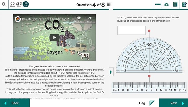
Empathy is more achievable than ever with modern online assessments, which allow test conditions to simulate reality in a way that cannot be achieved by textbooks and other written materials.
For example, this article in WIRED shares how a pair of professors created a video gamification of fieldwork for geology students, allowing them to virtually experience and interact with real-world test scenarios that they otherwise wouldn’t have had access to during COVID-19 conditions.
The point is these days examinations no longer have to be a one-size fits all. Building student personas into an assessment platform puts them at the heart of everything. There is a world of difference between the experience of taking ‘a’ test versus taking ‘my’ test.
4. Familiar: Keep common features where users expect to see them
There’s nothing more important during a high-stakes exam than providing a smooth, intuitive experience. We have already mentioned that most exam takers are either digital natives, or they are digital converts who struggle to remember life before 24×7 screens. A pen-and-paper exam feels uncomfortable to these groups.
Laure says that UX designers can use the ubiquity and familiarity of the design of the most popular everyday technology apps to their advantage. “Don’t reinvent the wheel if you don’t need to,” she says.
“For example, when we were designing our notifications, we researched how the most popular social media sites handled them. The same goes with menu placement. Generally it’s always on every page”. The consequences of deviating from what’s familiar can be high, she says.
“There is a real risk of creating anxiety for users if you try to change up fundamentals,” she says.
5. Control: Make your user feel that they’re in the driver’s seat
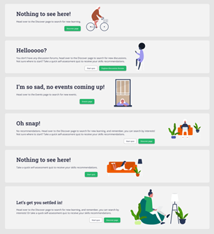
User-centric design reduces stress by putting test takers firmly in control of their exam experience. A purposeful UX design element includes well-thought-out empty-state screens with written and visual prompts that signpost to the test-taker either what’s happening, or what’s going to happen next. This avoids the situation where users have no feedback and no way of knowing if they should wait or if the platform has crashed.
“The design should always keep users informed about what is going on, through appropriate feedback within a reasonable amount of time,” says Laure. “If the system is ‘thinking’, tell that to the test-taker.”
A great UX also puts invigilators in control, giving them the ability to provide exactly the right equipment to test takers and removing the pressure for them to source it for themselves.
The best UX design is a UX design that users do not notice
The power of a well-designed UX truly cannot be underestimated. “When it comes to online exams, UX design created with empathy means the tech is simply a tool in the background where it belongs, rather than being an obstacle or source of distraction,” says Naomi.
It means that, on such an important day of their lives, it’s only the test candidates’ knowledge and performance that takes the centre-stage spotlight – right where it should.
Find out more about how Janison online assessment solutions can benefit your students by speaking to one of our advisors.

Janison
Janison is a leading edtech provider transforming the way assessments are delivered and experienced worldwide.